Abandonment Issues: What To Do About Abandoned Online Registration Forms

Form abandonment occurs when someone begins filling out a form on your website, but for some reason — and we’ll explore what these can be — the process is interrupted and they never complete the form. As forms are one of the main drivers of lead generation and ultimately sales, this directly translates into lost revenue and can be a huge problem for your business.
Whether you’re a service provider, software developer, eBook writer or a publisher in affiliate marketing, generating leads through forms on your website is key to bringing revenue into your business. Form abandonment equates to money lost, and so form abandonment deserves your attention.
Reasons For Form Abandonment
Once someone has clicked to fill in a form on your site, you might think that they’re in the bag. Yet research has shown that as much as two out of every three forms never make it to completion. That means your business is falling at the first hurdle in lead generation.
Forms can be abandoned for multiple reasons.
- Problems with the form design, like year of birth scroll boxes that start at 1900, or address boxes that wipe all a user has typed after they enter their zip code are exceptionally common.
- Asking too many questions on your form is a common mistake for planners. Yes, once you have a captive audience you want to get as much information about them as possible (and in fact, the more demographic information you have the better your targeted advertising can work in the future). But at the stage of lead generation the most important thing is that you get only the necessary information, before the customer switches off. For example, for registering to participate in important email surveys, the registration has to be short.
There is no set number of questions to have on the form, but it’s still good to use your best judgment when creating your form. For example, you definitely should collect the name and contacts, while asking to specify the user’s interests or links to social media profiles is unnecessary. - Security concerns also pose a major barrier to form completion. “If you’re asking someone to input personal details, or even credit card information,” explains Charles J. Wright, business writer at Paper Fellows and OXEssays, “you need to ensure that they know their sensitive details will be handled in a secure manner.” Try showing off the secure aspects of your site, like any awards you have won, laws you comply with, or the fact that you use HTTPS.
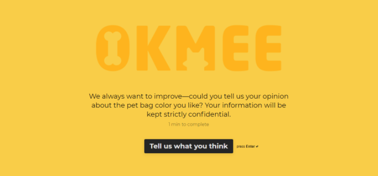
- Too much is shown to the user at once, and the form appears daunting. Sure, the form loads quickly and is otherwise perfect. But, as the users scroll down to the bottom, they can’t help but feel dread at the sight of all those tickboxes and dropdowns. Instead, it’s a good idea to just show the user one or two fields at a time, and they can press enter when they are ready to move on. Here is the good example:

Form abandonment is rife, but there are ways to improve your form completion rates. We’ll explore how to optimize your forms and generate leads.
The Fix
Optimize Form Experience
Getting the length of your form right is a balancing act that’s tricky to perform but crucial to the outcomes around form completion. Shorter forms almost always translate to a higher conversion rate, as barriers such as too many questions and the simple risk of distraction are minimized with a short form.
Yet if you reduce the fields across your forms with too much ferocity, your form will lose its function entirely. Also, users may be put off by seemingly inadequate questioning, like asking the user for their gender when it’s not necessary.
“Analyzing which fields are essential for creating a professional tone and strong relationship with the user is essential,” says Catherine F. Ford, CX blogger at Essayroo and State Of Writing. “Cutting forms back to the bare minimum can improve completion rates, but if you go too far you can lose customers entirely. If you can’t cut any more questions on your form, you can still streamline it by improving the UX of the form, so that additional questions take up less space and they’re easy to fill out by design.”
One of the best ways to improve the UX design of an online form is to arrange the fields from easiest to hardest, so that users can speed through the process without having to spend too much time on the complex questions. In fact, don’t use complex questions that require a lot of thought for your user. For example, “How satisfied or dissatisfied were you with this form today?” This question is complex and confusing, and would work better if broken into two separate questions: “How satisfied were you with today’s form?” and “How can we improve?”
One particularly successful form provider is TypeForm, a provider that shows the user just the bare minimum of a single field on each page when they’re filling out a form, so as not to put them off. Users can still monitor their own progress with the minimalist progress bar at the bottom of the page, to see how far along they are.
Removing Barriers
Customers are hard-won and reluctant to part with their cash. Bearing this in mind when creating your forms can improve completion rates as you emphasise key features that remove the barriers of entry. Money-back guarantees and flexible payment plans give people options and will prevent them from getting discouraged halfway through your forms.
It is also a great idea to be upfront and honest about what customers are getting when they hand over their money. For example, if there’s a paid event, then say upfront that admission to the event will cost people who choose to attend. So, remind your customers what they are buying at every stage of the form, so that they are more motivated to complete the form.
Optimized Load Times
In the digital world, attention is a hot commodity and taking it for granted is a huge mistake. If your site is slow to load, people are less likely to engage with it. It would be rude to assume you had them as a captive audience! Optimize load times across your website and form pages to ensure that you hold their attention and carry them all the way through to lead generation.
Try boosting your load time by either limiting options in dropdowns, or enabling users to use auto-fill in the fields. Only use as many years as you really need, for example, in a date of birth element. Cut out the parts that aren’t necessary (i.e. extra credentials) in the form, so that it doesn’t take up space. If the rough draft of your form can be divided into separate forms, then do that instead.
Also, consider making your form mobile-friendly, so that people aren’t crowding servers on their PCs or laptops. This allows more people to view your form on their mobile devices, and also to fill it out on the go.

Form completion rate is in your hands. By optimizing your forms and removing classic barriers to form completion, your business can generate more leads, and directly translate these into sales and revenue. Your customers are out there, go get ‘em.
Katherine Rundell is a writer and editor at Dissertation Help and Law Essay Help services. She is also a contributing writer for Lia Help. Katherine writes about marketing trends.